Key takeaways
- High-altitude sun makes most colors read lighter and brighter outdoors than they look on a chip indoors.
- North-facing rooms pull colors cooler and grayer; south and west rooms push them warmer and washed out.
- On vinyl siding, dark colors must come from a vinyl-safe collection or the panels can warp.
- Fixed elements decide more than taste: roof color, brick, stone and concrete are not changing.
- Test large samples on the actual surface and look at them morning, midday and evening before committing.
Why the chip lies in Colorado
Every paint store chip is viewed under store lighting, held at arm's length, surrounded by other colors. Your house is viewed in Colorado daylight, across a surface hundreds of times larger, next to a roof, a lawn and a sky that is doing its own thing.
Two forces make the gap wider here than in most places.
There is more ultraviolet and more direct sun
The World Health Organization notes that UV increases by roughly 10 percent for every 1,000 meters of elevation. Denver sits near 1,600 meters, and much of our service area sits higher. Combined with Colorado's famously clear skies and high number of sunny days, exterior colors receive more intense, less filtered light than the same color would at sea level.
The practical result: colors read lighter and less saturated outdoors here. Homeowners who choose a mid-tone gray from a chip frequently end up with something closer to a light gray on the house.
Interior light is dramatic and directional
Large windows, bright snow reflection in winter and strong seasonal sun angles mean interior colors shift noticeably through the day. A greige that looks warm at 9 a.m. can look distinctly purple at 4 p.m. in a west-facing room.
Start with which way the wall faces
| Exposure | How it affects color | What to do about it |
|---|---|---|
| North-facing rooms | Cool, even light. Colors read grayer and flatter. | Choose colors with a warmer undertone than you think you want. |
| South-facing rooms | Bright warm light most of the day. Colors wash out. | You can go deeper than you expect without the room feeling dark. |
| East-facing rooms | Warm in the morning, cool and flat after noon. | Test in the afternoon, when the room is least flattering. |
| West-facing rooms | Cool early, intensely warm in late afternoon. | Watch for undertones amplifying at sunset, especially pinks and purples. |
| South and west exteriors | Maximum UV, maximum fading pressure. | Favor quality exterior lines and understand deep colors will work harder. |
| North exteriors | Shade, slower drying, possible mildew near sprinklers. | Keep an eye on moisture; color holds longer here. |
Choosing exterior colors for a Colorado home
Work from what cannot change
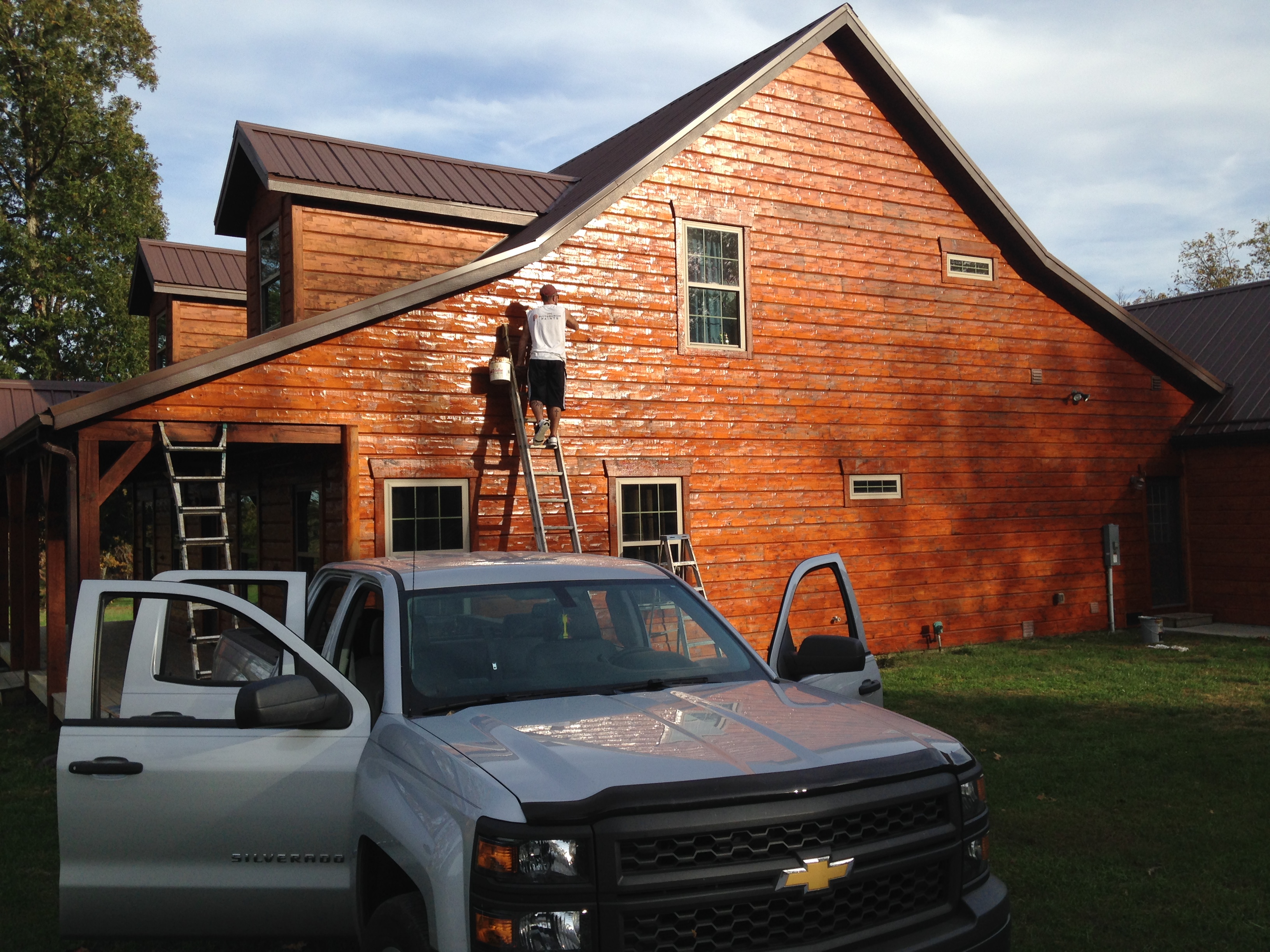
Before you look at a single chip, write down your fixed elements: roof shingle color, brick or stone, concrete walkways, window frame color and any fencing. Those elements will outlive your paint job, and a color that fights them will bother you every time you pull into the driveway.
- Brown or tan roof? Warm body colors generally harmonize more easily than cool grays.
- Gray or black roof? Cool grays, greiges, deep greens and navy all work comfortably.
- Red or orange brick? Creams, warm whites, sage and deeper earth tones usually sit better than crisp cool white.
- Light stone accents? Pull the body color from a tone in the stone rather than competing with it.
Color families that work well along the Front Range
- Warm whites and creams. Classic on bungalows and farmhouse-style homes, and they handle bright Colorado light without looking stark.
- Greige. The dominant neutral for a reason: it works with both warm brick and cool stone.
- Sage and muted greens. Echo the foothills and look natural against evergreens.
- Deep charcoal and near-black. Dramatic on modern and mountain-modern homes, with the caveat that dark colors absorb heat.
- Navy and deep blue. Popular on doors and shutters, and increasingly on bodies with white trim.
- Warm bronze and clay. Good transitional choices that work with stone, stucco and wood accents.
Popular starting points with real color codes
These Sherwin-Williams colors come up constantly on Denver-area projects. Treat them as a direction to sample, not a decision.
| Color | Code | Where it works |
|---|---|---|
| Alabaster | SW 7008 | Warm white body or trim; farmhouse and bungalow exteriors |
| Pure White | SW 7005 | Clean trim white that is not icy |
| Agreeable Gray | SW 7029 | The default greige for interiors and some exteriors |
| Accessible Beige | SW 7036 | Warm neutral body that pairs with brown roofs and stone |
| Repose Gray | SW 7015 | Cooler greige for modern and ranch exteriors |
| Evergreen Fog | SW 9130 | Muted sage, strong on craftsman and bungalow bodies |
| Pewter Green | SW 6208 | Deep green for doors, shutters and accent elevations |
| Urbane Bronze | SW 7048 | Warm charcoal for doors, garage doors and trim accents |
| Iron Ore | SW 7069 | Near-black body color on modern exteriors, or crisp trim contrast |
| Naval | SW 6244 | Deep navy front doors and shutters |
Our color selection page shows these as swatches and lets you preview palettes applied to a house illustration by home style.
The vinyl siding rule you cannot ignore
Vinyl siding can be painted, but color choice is a technical decision, not an aesthetic one. Darker colors absorb more heat, and vinyl expands when it gets hot. Go too dark and panels can warp, buckle or pull from their fasteners.
Both Sherwin-Williams and PPG publish color collections formulated specifically for vinyl, often marketed as vinyl-safe or siding-safe. Those collections use pigments engineered to reflect more heat, which lets you go deeper than the panel's original color without the thermal problem.
If a contractor offers to paint your vinyl a deep charcoal without mentioning vinyl-safe colors, that is a signal about the rest of their process. More on how we select products is on our paint brands page.
HOA approval: the part people forget until it delays them
A large share of Front Range neighborhoods are covenant-controlled, including most of Highlands Ranch, Castle Rock, Parker, Broomfield's Anthem and Broadlands, and many Aurora and Centennial subdivisions.
How the process usually works
- Request or download your community's approved palette or color guidelines.
- Choose a scheme, often body, trim and accent together rather than individually.
- Submit an improvement request with the color names, codes and sometimes physical samples.
- Wait for architectural review, which can take weeks depending on the community and the season.
- Schedule the work after approval is granted.
Practical tips
- Submit early. Spring is high season for both painting and review boards.
- Ask whether same-color repaints need approval. In some communities they still do.
- Check neighbor spacing rules. Some communities restrict identical schemes on adjacent homes.
- Keep the approval letter. It matters at resale and if a board member changes.
Our Highlands Ranch page covers HRCA specifics, and we prepare submissions as part of the project on any covenant-controlled property.
Interior color, room by room
Living areas
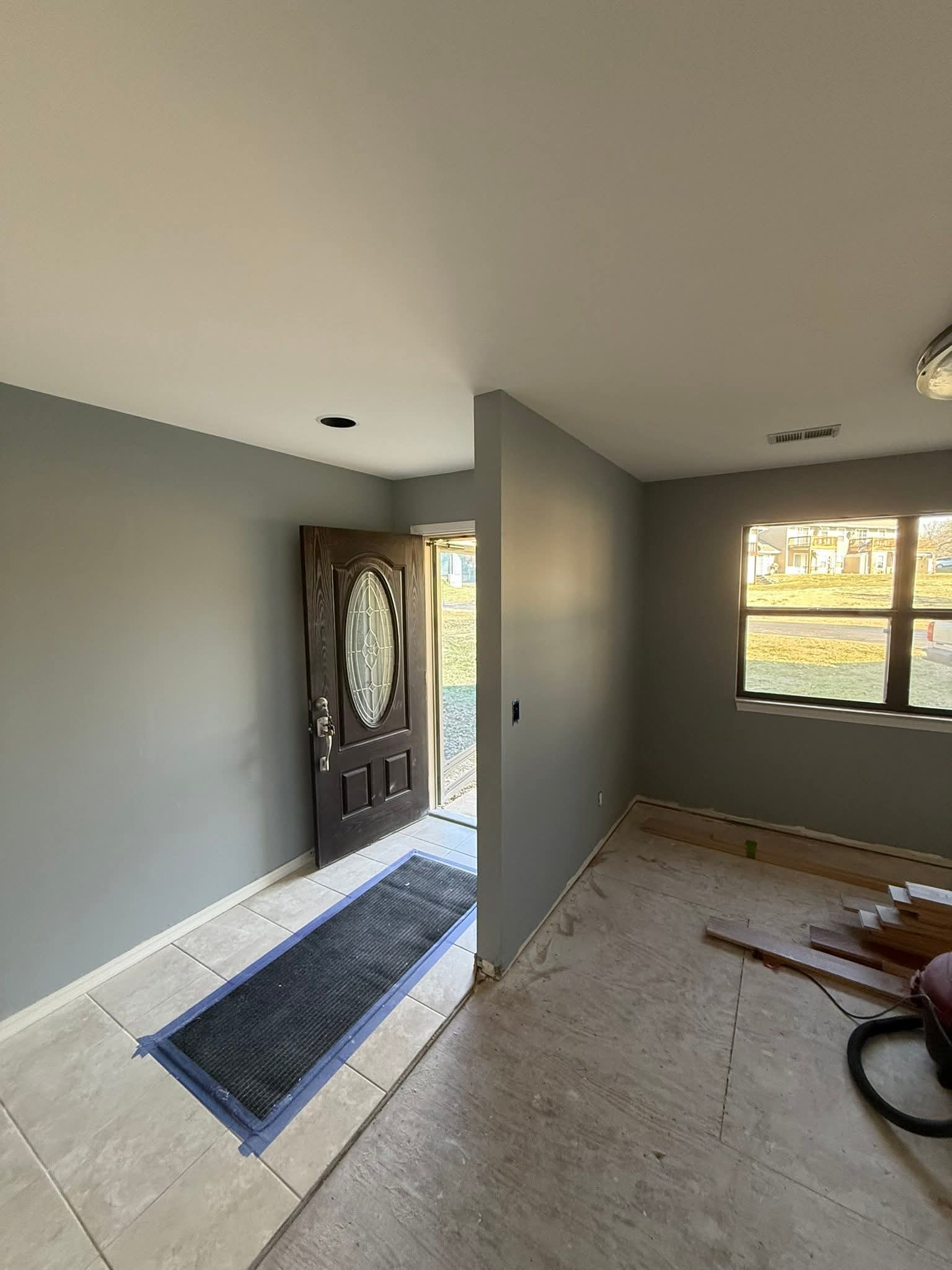
Warm whites, greiges and soft neutrals dominate because they let furniture, art and Colorado views do the work. If the room faces north, lean warmer than your instinct.
Kitchens
Cabinet color drives the room. Warm whites and greiges on uppers with a deeper green, navy or charcoal on the island is the current default, and it photographs extremely well for resale. See our cabinet painting page for how finishes affect the look.
Bedrooms
Softer, slightly deeper tones work here. Because bedrooms are used at the beginning and end of the day, test samples in morning and evening light specifically.
Bathrooms
Light, clean colors in a satin or kitchen-and-bath finish. Humidity makes finish choice as important as color.
Basements
Front Range basements often have limited natural light. Very light colors can look flat and gray; a warm white or a light warm neutral usually reads better than a cool one.
Hallways and stairwells
High-traffic and usually low-light. Durable washable finishes matter more than the exact hue, and slightly deeper colors hide wear better than bright whites.
Sheen changes color more than people expect
The same color in two sheens reads differently. Higher sheen reflects more light, which makes the color look lighter and more saturated while also revealing every imperfection in the surface.
| Sheen | Typical use | Effect on color and surface |
|---|---|---|
| Flat | Ceilings, low-traffic walls, some exterior bodies | Deepest color appearance, hides flaws, least washable |
| Matte / eggshell | Living rooms, bedrooms, hallways | Soft depth with reasonable cleanability |
| Satin | Kitchens, baths, kids' rooms, exterior trim | Brighter appearance, easier cleaning, shows texture |
| Semi-gloss | Trim, doors, cabinets, railings | Most reflective and durable, highlights every surface flaw |
How to test colors so you only paint once
This is the part that saves money, and almost nobody does enough of it.
- Narrow to three. More than three samples creates paralysis, not clarity.
- Go big. Paint at least a two-foot square, or use large peel-and-stick samples. Small dabs are useless.
- Test on the actual surface. Siding texture, stucco and drywall all render color differently.
- Put samples on multiple elevations or walls. Especially the north and south sides.
- Look at them at three times of day: morning, midday and evening, plus once under your interior lighting at night for interior colors.
- View them next to fixed elements. Hold the sample against the brick, the roof line, the countertop or the floor.
- Live with them for a few days. First impressions and third-day impressions are often different.
- Check undertones in shade. Undertones hide in bright sun and show themselves in shadow.
Color and curb appeal when you are selling
If the goal is resale, the calculus changes. Buyers are looking at listing photos on a phone, and the exterior photo determines whether they book a showing.
- Favor broadly appealing neutrals for the body, with personality in the door color.
- Make trim crisp. Clean trim lines read as "well maintained" faster than any single color choice.
- Paint the front door. It is the least expensive high-impact update available.
- Do not ignore the garage door. On many Front Range homes it is the largest single visual element from the street.
- Inside, go neutral and consistent. Buyers mentally subtract the cost of repainting anything bold.
Six color mistakes we see in Denver homes
- Choosing from a chip indoors and committing. The single most common and most expensive mistake.
- Ignoring the roof. A cool gray body under a warm brown roof fights itself permanently.
- Underestimating how light reads outside. Many homeowners end up one or two shades lighter than they intended.
- Dark colors on vinyl without checking vinyl-safe collections. This one has physical consequences, not just aesthetic ones.
- Matching trim to an off-white that clashes. Trim whites have undertones too, and the wrong one looks dingy next to the body.
- Skipping HOA approval. Repainting a house twice because of a rejected color is a painful way to learn the process.
What a free color consultation actually includes
When we say color help is included with your estimate, this is what that means in practice:
- A conversation about what you like, what you dislike and what cannot change
- A short list narrowed from the Sherwin-Williams, PPG and Behr libraries, rather than a catalog dump
- Large samples applied to your actual walls or siding
- A second look at different times of day before anything is ordered
- HOA palette research and submission materials where required
- Sheen recommendations surface by surface, since sheen affects both durability and perceived color
Undertones: the thing that makes you hate a color later
Most color regret in Colorado homes is not about the color. It is about the undertone, the subtle secondary cast that only shows up at scale and in certain light.
How to see an undertone
- Compare against pure white. Hold a sheet of printer paper next to the sample. The cast that appears is the undertone.
- Look at it in shade. Bright direct sun hides undertones. North light and shadow reveal them.
- Compare three at once. A greige looks neutral alone and distinctly green or pink beside two others.
- Check it against the floor. Wood floors in Front Range homes often carry strong orange or red casts that fight cool grays.
Common undertone traps
- Gray that goes blue in north-facing rooms and on shaded north elevations.
- Greige that goes purple under late-afternoon west light.
- Beige that goes yellow next to warm incandescent fixtures.
- White that goes dingy next to brighter trim white or new vinyl windows.
- Green that goes gray on an exterior under overcast skies.
Trim, door and accent pairings that work
Exterior color is really a three-part decision. These combinations come up repeatedly on Front Range homes because they solve the problem rather than just looking nice on a chip.
| Body | Trim | Door or accent | Works well on |
|---|---|---|---|
| Warm white (Alabaster SW 7008) | Near-black (Iron Ore SW 7069) | Natural wood or bronze | Modern farmhouse, new builds in Parker and Castle Rock |
| Greige (Agreeable Gray SW 7029) | Clean white (Pure White SW 7005) | Navy (Naval SW 6244) | Two-story suburban homes with stone accents |
| Muted sage (Evergreen Fog SW 9130) | Warm white | Warm charcoal (Urbane Bronze SW 7048) | Bungalows and craftsman homes in older Denver neighborhoods |
| Warm beige (Accessible Beige SW 7036) | Soft white (Snowbound SW 7004) | Deep green (Pewter Green SW 6208) | Homes with brown roofs and tan brick |
| Cool greige (Repose Gray SW 7015) | Pure white | Black or bronze | Mid-century ranches in Littleton and Lakewood |
| Near-black (Iron Ore SW 7069) | Warm white | Wood door, sage accents | Mountain modern and contemporary exteriors |
Two practical rules. First, trim should contrast enough to read as a line from the street, which usually means more contrast than looks right on a small chip. Second, the door is where personality belongs, because repainting a door later costs almost nothing.
Making interior colors flow from room to room
Open floor plans mean you are rarely looking at one color at a time. Three approaches that work:
One color, varied sheen
A single wall color throughout the main level with flat on ceilings, eggshell on walls and semi-gloss on trim. Calm, cohesive, and the easiest to touch up later.
One family, varied depth
The main color at full strength in the living area, a lighter version in smaller rooms, and the deepest version in a study or powder room. Because they share a base, the transitions never jar.
Neutral envelope, saturated moments
Neutral throughout, with one or two rooms or features taking real color: an island, a built-in, a dining room, a mudroom. This gives personality without committing the whole house.
In all three, keep the trim and ceiling color consistent through the entire level. That consistency is what makes a house read as designed rather than assembled.
Color by Denver neighborhood and home era
Older central Denver: Berkeley, Sunnyside, Wash Park, Platt Park
Bungalows and foursquares with deep porches, substantial trim and often original brick. Earthy greens, warm whites and historically sympathetic palettes look right here. Painted brick is common but is effectively permanent, so think it through.
Mid-century suburbs: Littleton, Lakewood, Centennial, Thornton
Long ranch rooflines and brick-plus-siding combinations. The usual winning formula is a light to mid body color, crisp trim and a strong door, which modernizes a low horizontal facade without fighting the brick.
1990s and 2000s subdivisions: Highlands Ranch, Aurora, Broomfield
Two-story elevations with stucco, stone and garage-forward facades, and almost always an HOA palette. Warm neutrals with crisp trim dominate because they satisfy the covenants and work with the stone.
Newer builds: Parker, Castle Rock, far east Aurora
Fiber cement, mixed materials and plenty of modern farmhouse. Warm white with black trim remains the dominant look, and darker bodies are increasingly common where the HOA allows them.
Each of our service area pages covers the local housing stock and HOA situation in more detail.
Trend versus timeless
Exterior color is a 7 to 12 year decision in Colorado. Interior color is more like 5 to 8. That difference should change how much trend you buy into.
- Safe for a decade: warm whites, soft greiges, muted greens, warm charcoals. These have been stable for years and sit comfortably with brick, stone and wood.
- Currently popular, slightly riskier: very dark bodies, high-contrast black trim, strong two-tone cabinet schemes. Beautiful now, and more era-specific than neutrals.
- Short-lived: highly saturated accent walls, strong color on large trim runs, and anything chosen because it looked good in someone else's light.
- Timeless anywhere: clean, consistent trim lines and a well-maintained finish. The quality of the paint job reads before the color does.
Matching colors across brands
If you fall in love with a color from one brand but want a different brand's product, a few realities are worth knowing.
- Cross-brand matches are approximations. Tinting systems and bases differ, so a match may be very close but rarely identical.
- Sheen affects the match. The same formula in two sheens will not look the same, which matters when matching an existing surface.
- Bring a physical sample. A chip, a door, a piece of trim or a cut-out from an inconspicuous area gives a scanner something real to read.
- Scanned matches need verification. Always test the match on the actual surface before committing to gallons.
- Keep your formulas. Ask for the final formula and sheen in writing at the end of the project so touch-ups years later are simple.
We work across Sherwin-Williams, PPG and Behr, so if you want a particular color in a particular product, we will tell you honestly how close the match will be.
How we run color selection on a real project
- Look at the fixed elements first. Roof, brick, stone, concrete, windows, fencing, and inside, floors and counters.
- Narrow by exposure. North-facing rooms and elevations get warmer options; south and west get colors that can take intense light.
- Check the HOA. If the community has a palette, that narrows the field before taste enters the conversation.
- Sample big and sample on site. Large samples on multiple elevations or walls, viewed at several times of day.
- Decide trim and accents together. The relationship matters more than any single color.
- Confirm sheens by surface, balancing durability against how much surface texture you want revealed.
- Write it all down. Color names, codes, sheens and surfaces go into the estimate so there is no ambiguity on day one.
What large samples should cost you, and why they are worth it
Sample paint feels like a waste until you compare it with the cost of repainting a whole elevation you dislike. A few practical notes:
- Sample pots are inexpensive relative to the project, and peel-and-stick samples are now widely available in large sizes, which avoids painting patches you then have to cover.
- Two coats on the sample. One coat of a sample reads lighter and thinner than the finished wall will.
- Put samples where you will see them repeatedly: next to the front door, on the wall you look at from the couch, on the elevation you see pulling into the driveway.
- Never sample only on an interior wall for an exterior decision. The light is a different animal outdoors here.
- Photograph your samples. Phone photos at different times of day make the differences obvious and give you something to compare later.
Color decisions on specific surfaces
Front doors
The cheapest high-impact decision in the house. Doors take a harder-curing enamel than siding, and dark colors on a sun-facing door get hot, so product selection matters as much as color.
Garage doors
On many Front Range homes the garage door is the largest flat surface facing the street. Painting it to match the body usually makes a house read as larger and more cohesive; painting it to match the trim emphasizes it, which is rarely what anyone wants.
Shutters and accents
Accent elements can carry more saturation than the body because there is less of them. This is where deep greens, navy and black earn their keep.
Stucco
Stucco holds color differently than siding because of its texture, and the same color can read a half shade darker. Breathable masonry coatings are also formulated differently, so sample on the stucco itself.
Ceilings
A flat white ceiling is the default, but a ceiling tinted a quarter strength of the wall color often looks more intentional and photographs beautifully in rooms with good natural light.
Interior doors and trim
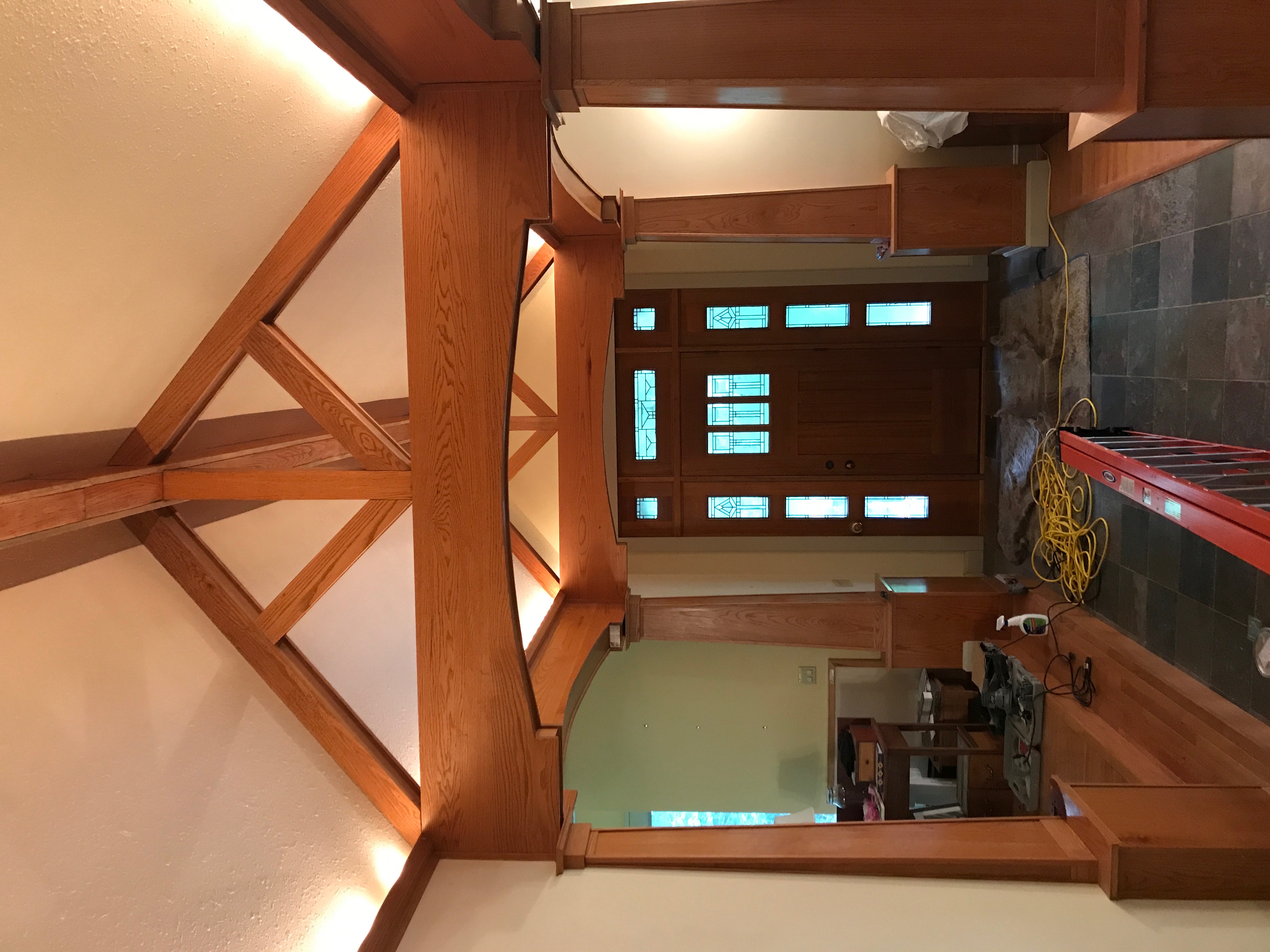
Consistent trim color through a whole level is what makes an interior feel designed. Changing trim color room to room almost always reads as unfinished rather than creative.
Interior lighting changes everything
Paint color is light reflected off a surface, so the light source is half the equation. Two homes with the same wall color and different bulbs look like different colors.
- Color temperature matters. Warmer bulbs push colors yellow and cozy; cooler bulbs push them gray and crisp.
- Test under your actual fixtures at night, not just in daylight, especially in rooms you use after dark.
- Mixed sources confuse things. A room with warm lamps and cool recessed cans will show a color two different ways at once.
- Dimmers shift perception. Dimmed incandescent and some LED sources warm significantly at low output.
- Reflected color counts. A green lawn outside a south window, a red brick patio, or a large wood floor all bounce color onto your walls.
This is the reason we insist on viewing samples at several times of day, including after dark, before any color goes into a written estimate.
How to commit without second-guessing yourself
Color decisions stall for the same reason most decisions stall: there is no obvious finish line. These rules help people get there.
- Decide the role of each color first. Body colors should be quiet, trim should be crisp, and accents are where personality belongs. Once that is settled, the field narrows fast.
- Limit the comparison set. Three samples, not twelve. The brain stops distinguishing after a handful.
- Trust the surface, not the chip. Whatever the large sample on your own wall says is true. The chip, the screen and the photo from someone else's house are not.
- Accept that light will change it. A color that looks slightly different at 8 a.m. and 6 p.m. is not a mistake; that is what paint does.
- Remember what is reversible. Doors and accents are easy to change later. Painted brick is not.
- Ask a professional which one is risky. We will tell you honestly if a choice is going to fade quickly, fight the roof, or create a problem on vinyl.
And if you simply cannot decide between two, pick the one you liked first. That instinct is usually right, and the second-guessing is usually the chip lying to you.
The bottom line
At 5,280 feet, color behaves differently than it does on the chip rack. Start with your fixed elements, respect the exposure of each wall, mind the vinyl-safe rule, get HOA approval early, and test large samples in real light across several days. Do those things and the color you choose is the color you will still like in year five.
Want help narrowing it down? Book a free estimate with color consultation or call 720-208-5645. Projects booked by October 31, 2026 receive 25% off labor.

Written by Denver Paint Contractors. Painting contractors serving Denver and the Front Range with over 20 years of experience, full insurance and a 5-year workmanship warranty. About us or call 720-208-5645.